SoundCloud
— reimagined
[ summary ]
SoundCloud is a music and podcast streaming platform that allows users to listen to millions of songs from around the world, or upload their own. Users use this platform for its easy to access electronic music, DJ sets, and underground music.
overview —
[ visual interface, redesigned ]
A completely new look & feel keeping the core elements that define SoundCloud as a music platform.
[ navigation, simplified ]
Filter music in a simple way and navigate quickly through the content.
[ quick options, redefined ]
Add to the queue, share, like, repost and other quick options are available just with one tap.
[ dj sets, reimagined ]
SoundCloud recognizes songs inside music mixes or DJ sets to help the user discover new music.
[ design opportunity ]
Create a redesign focused on refining elements that make users choose SoundCloud over similar applications and adding new features to turn the platform into a unique experience.
skip the design process 🡒
research —
[ context ]
As regular users we always got frustrated by some design aspects and navigation problems, so as music lovers and designers, we decided to redesign it, knowing that there was room for improvement.
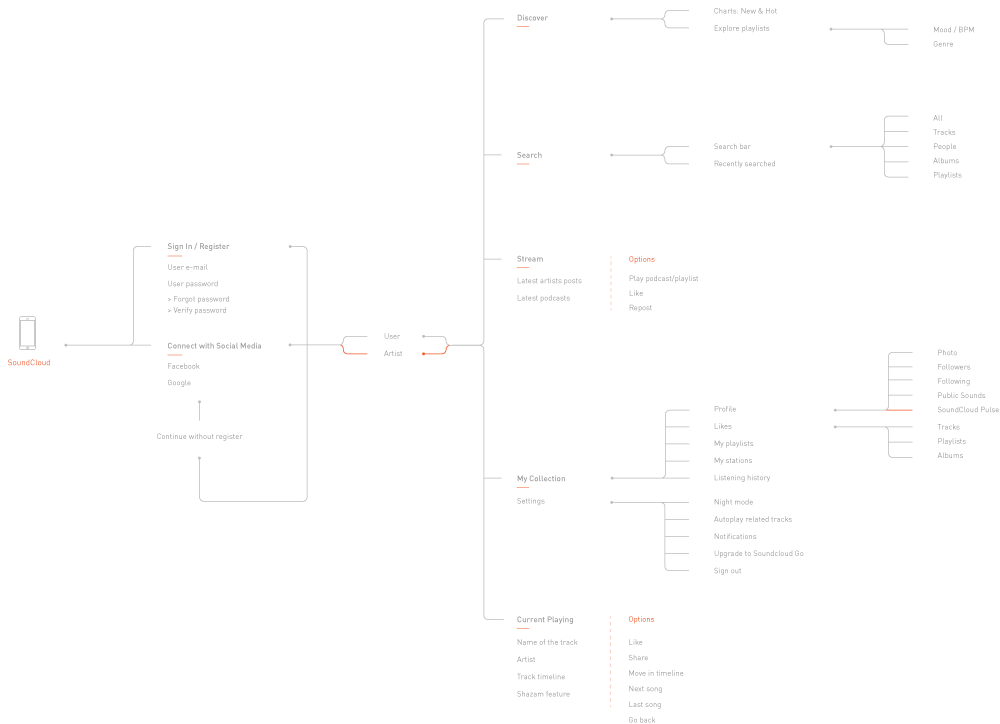
[ interface analysis ]
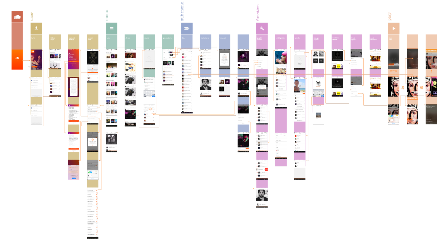
As a first step, we mapped a screen flow to analyze the visual elements and the information display. We found one main issue: lack of consistency. SoundCloud uses too many ways to visualize elements and this visualization changes on every screen. We used this analysis to point out elements that needed to be changed in the redesign.
[ navigation analysis ]
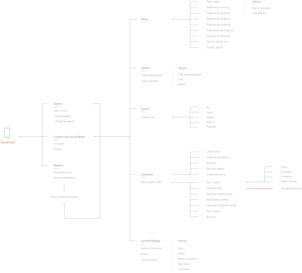
Along with the screen flow, we visualized the information architecture to analyze the navigation, which also had two main issues: repeated content and unnecessary steps. This analysis allowed us to focus on which navigation elements we had to focus on while creating the redesign.
[ swot analysis ]
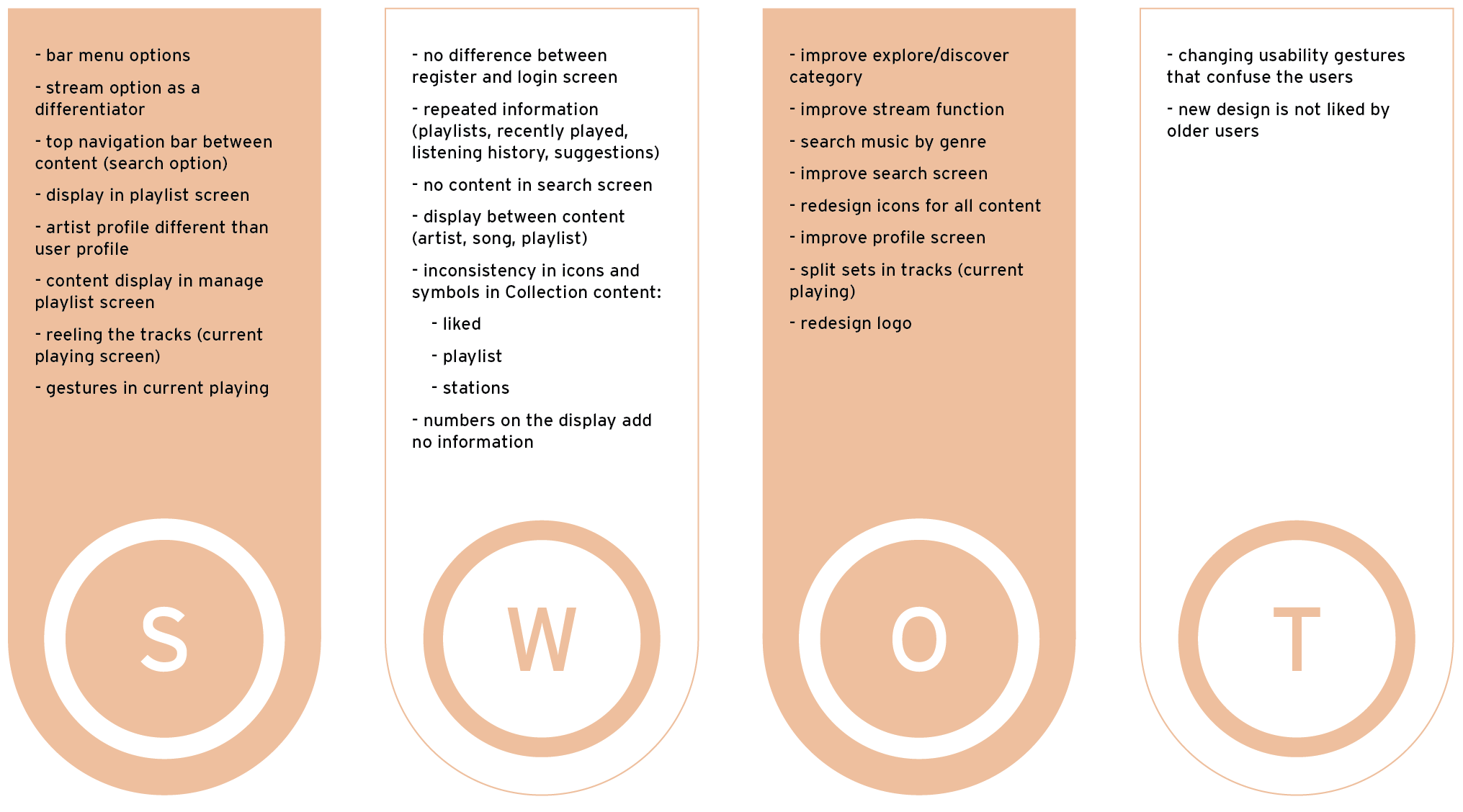
Before the design phase, we did a SWOT analysis (Strengths, Weaknesses, Opportunities, and Threats) as a way to group all the results from the previous analysis and get a clear idea of what we wanted to change in terms of interface and navigation. We decided to keep the strengths, focus on improving the weaknesses and turn the opportunities into features.
[ new information architecture ]
The main goal of this analysis was to simplify the navigation path and the number of screens needed. This visualization allowed us to rename content and create a seamless experience.
[ paper first ]
Once the content and the elements were defined, we started sketching wireframes and concepts. While doing all this we were discussing the pros, cons, and "what-ifs" of each sketch. Some new features were already shaping into what we wanted to achieve.

[ user testing ]
Before digitalizing our sketches we did some paper prototyping with possible users to test if we were on the right path. The results helped us to define some interface elements and to validate the information architecture we had.
ideation —
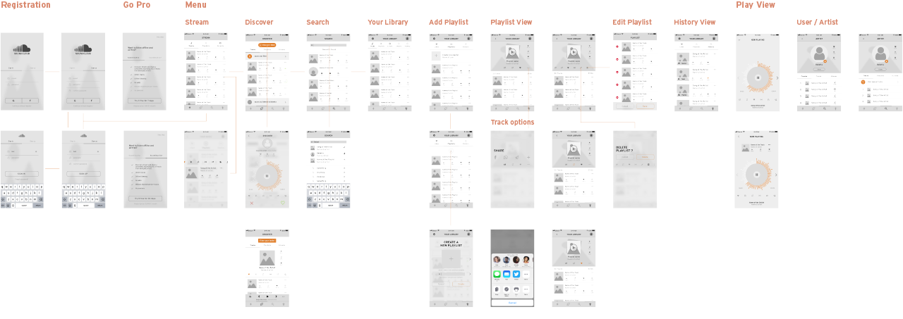
[ wireframing ]
At this point, we focused on a screenflow that could work already as an MVP (Minimum Viable Product), digitalizing those screens to start working on an early version of the final visual interface.
[ look & feel ]
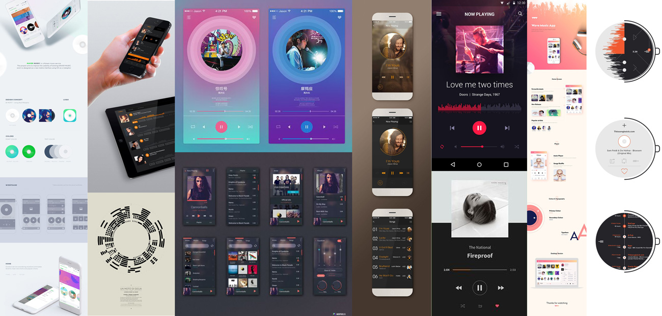
One of the biggest challenges for the visual interface was to create a design that could look interesting on its own. We did some mood boards to get visual inspiration for colors, shapes and graphical elements that could work for the new features.
[ final concept validation ]
We created a digital high fidelity prototype to test with some target users the final navigation and the interface elements from the first user testing session. After iterating many times along the process, we developed a functional and good-looking solution for the overall visual interface.
redesigned screens —
[ final design ]
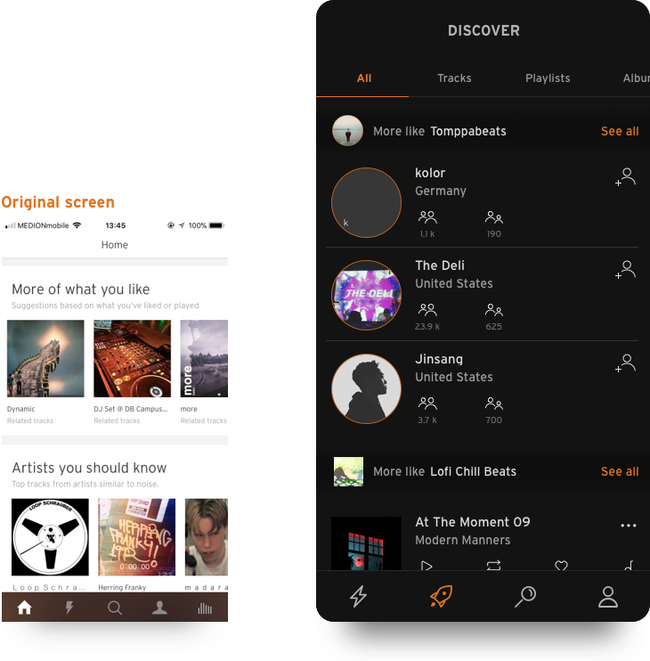
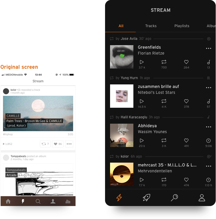
Showing the old screens intends to demonstrate how the main navigation screens were redefined to create the new SoundCloud design. These screens try to enhance the Strengths identified in the SWOT Analysis.
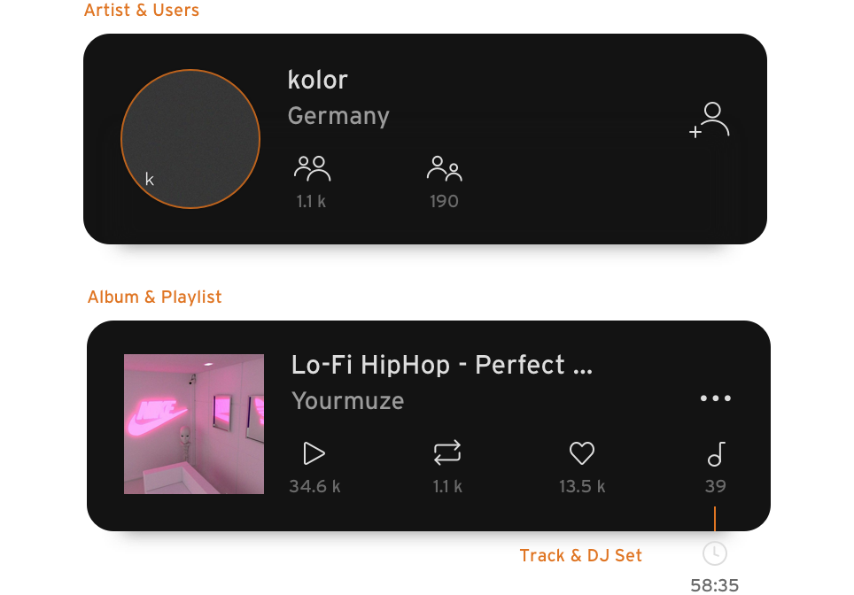
[ stream ]
The new SoundCloud focuses on the social environment. Stay updated with the latest activity from artists and other followed users and filter this activity on each category with the tab bar filter.
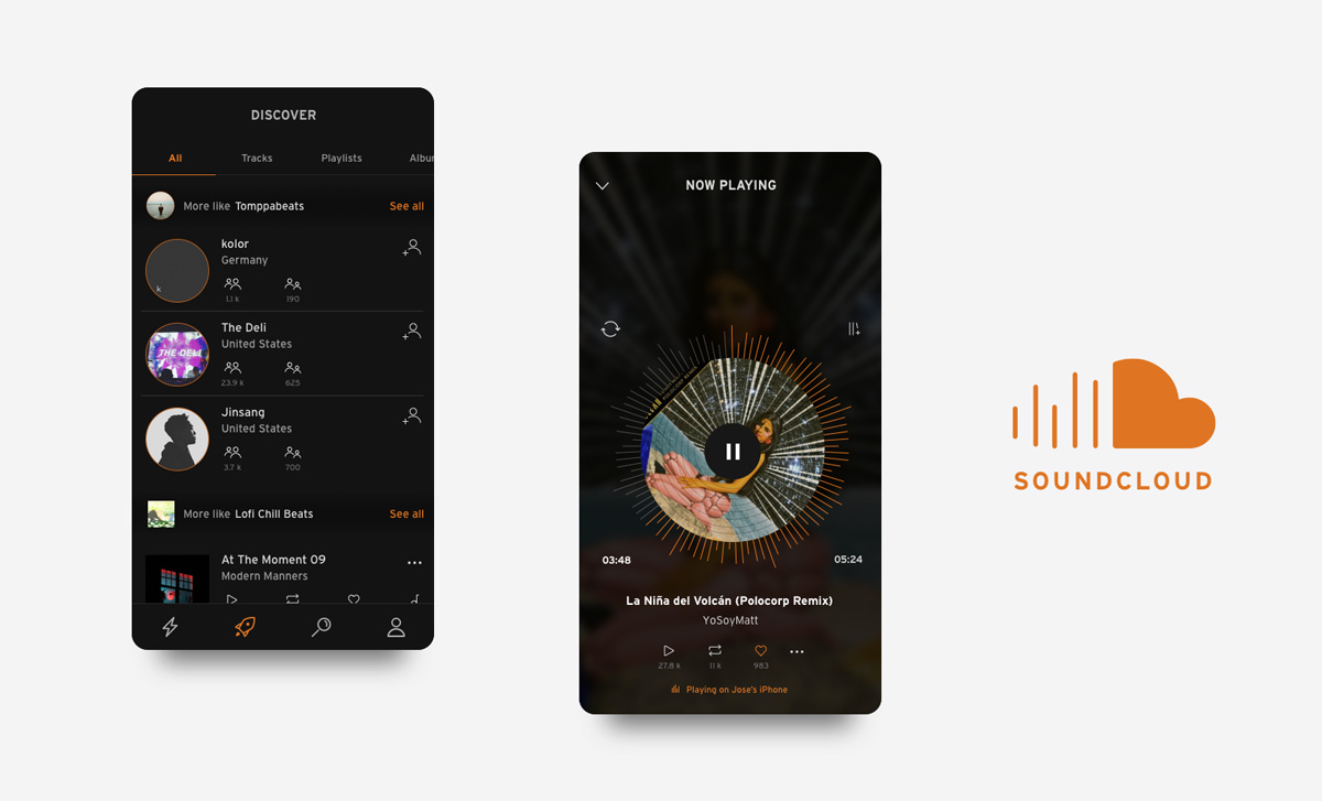
[ discover ]
Get all the suggestions and content from the old Home screen, but this time focused on discovering new music and artists based on previous activity.
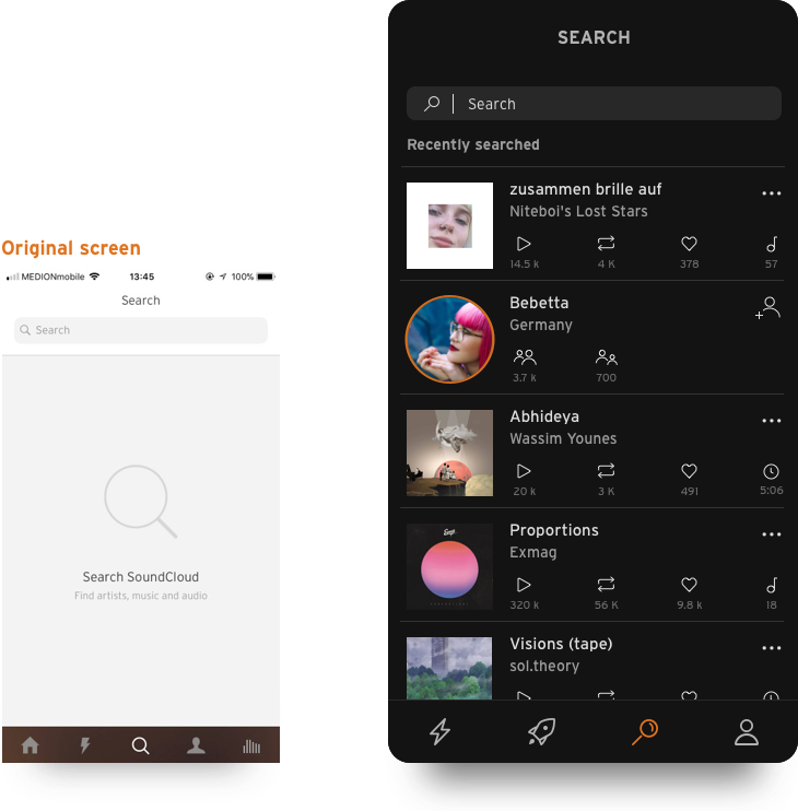
[ search ]
Empty screen? Not anymore. Quick access to recent searches and results or just tap in the search bar to start exploring.
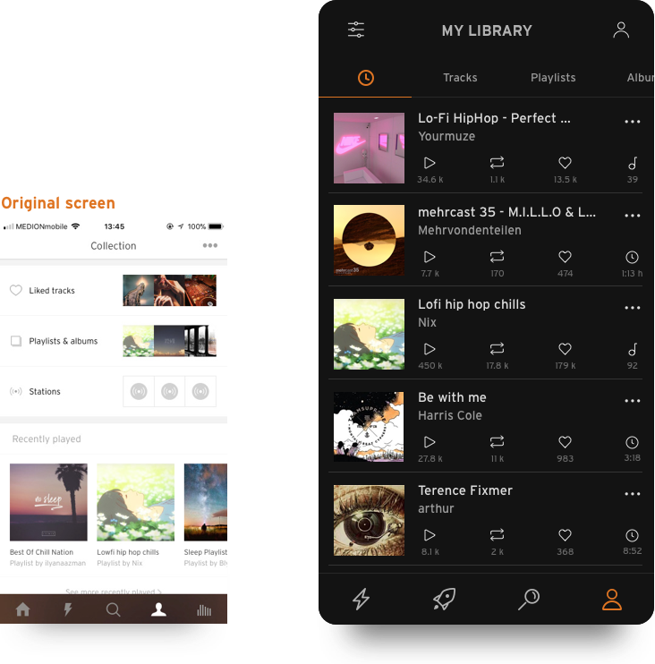
[ library ]
Here is where all the content marked as “Liked” goes, but now it’s filtered and displayed by categories. The recently played content will be always available here too.
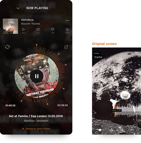
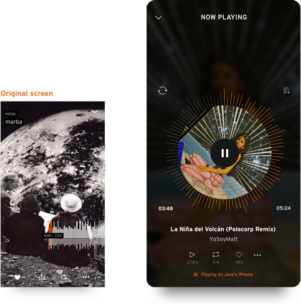
[ now playing ]
A tribute to SoundCloud’s iconic fullscreen combined with a music lovers classic: the vinyls. Get all the important information from the current song and quick options to Like or Repost the current track.
new features —
[ current track, minimized ]
Instead of a menu tab to go the Now Playing screen, SoundCloud shows a minimized version of it with quick options to pause or skip the current song or simply go back to the fullscreen mode.
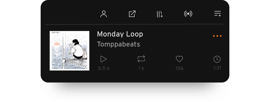
[ quick options, simplified ]
Share a playlist or add a track to the queue just by tapping on the three dots in any content element and accessing the quick options. These options change depending on the category of the selected element.
[ dj sets, redefined ]
The coolest feature of the new design. SoundCloud is able to recognize songs inside DJ sets to redefine the way you discover music. The checkpoints in the playing bar show when there’s a new song coming.
key details —
[ cornerstones ]
It is necessary to highlight the key elements in which we focused this redesign process: the navigation, the social aspect, and the content coherence. These elements are our approach to the Weaknesses identified in the SWOT Analysis.
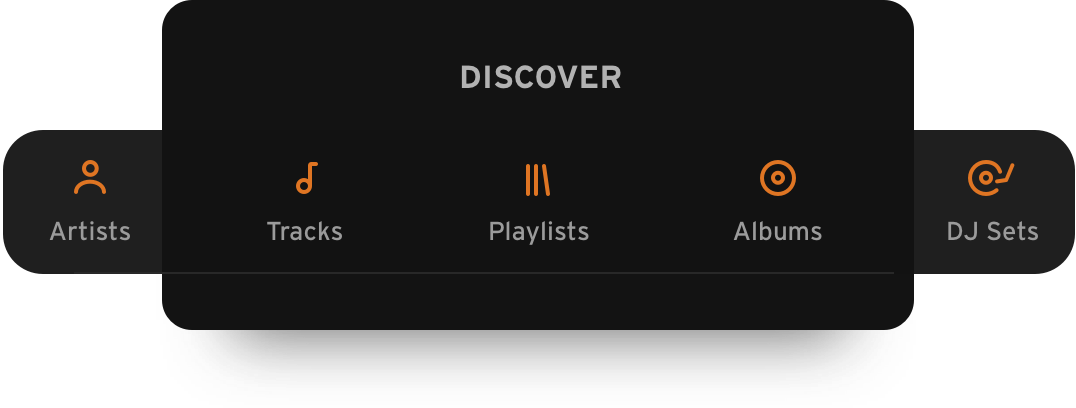
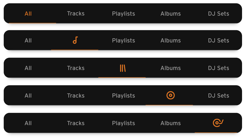
[ navigation & filters ]
This is the main aspect of the new design. We renamed and reorganized the four main screens in the main menu and created a tab bar filter that could be applied across all screens. Every filter in the tab has its own label and icon to help the user recognize the icon along with the new interface.
[ content & coherence ]
SoundCloud had at least three ways of showing the same content (tracks, playlists, etc) and this changed in every screen. We focused on creating a design that could help the user recognize each content category easily.
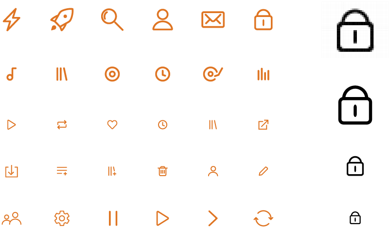
[ icons ]
All the icons were redesigned to keep with the consistency mentioned all along the process. It was important to create an icon family that could look unified when it was displayed on any screen size.
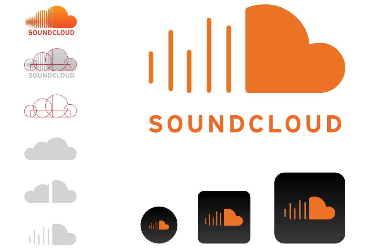
[ ... and a new logo! ]
A logo redesign to make it look simple as the app! This new logo was used to create the icons for different mobile operating systems.
[ final thoughts ]
With this project, I try to showcase the importance of the analysis phase and the user experience. The analysis of the existing app gave the project clear goals in terms of navigation, interface design and possible opportunities to create new features.
HfG Schwäbisch Gmünd, Application Design — 2017