GravityFed
— social platform
[ summary ]
GRAVITYFED™ is an influencer marketing platform for the outdoors. The platform connects influencers and brands, where influencers are able to post product reviews, sponsored posts, affiliate partnerships, and more.
overview —
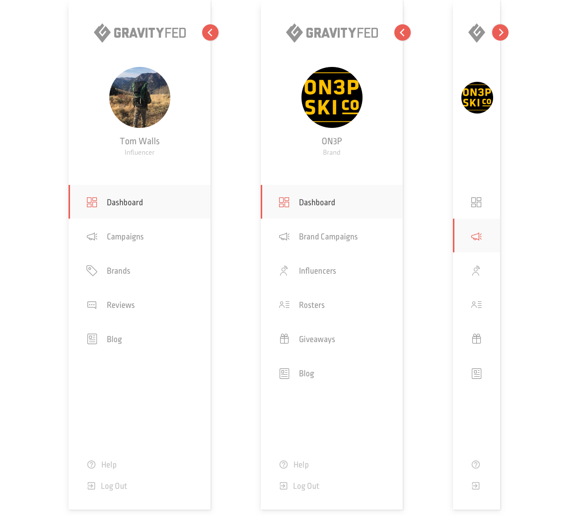
[ navigation bar ]
A sidebar to simplify the navigation through the different features, options, and content for brands and influencers.
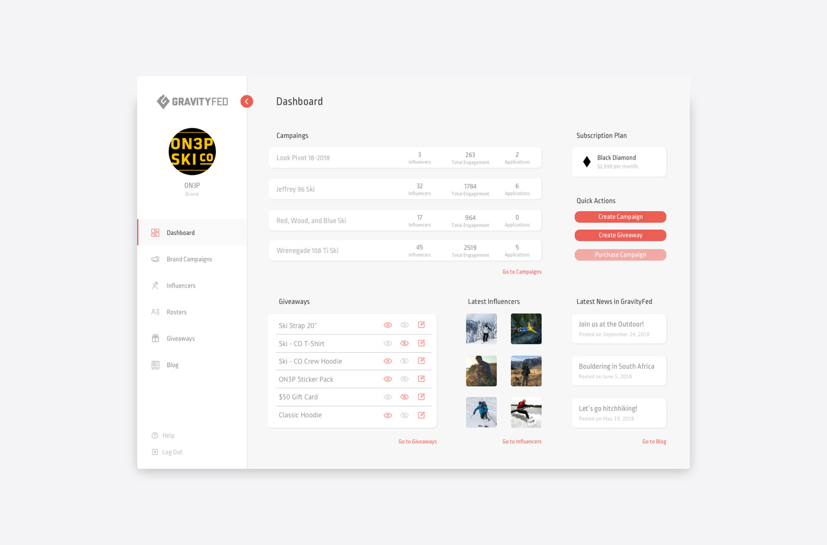
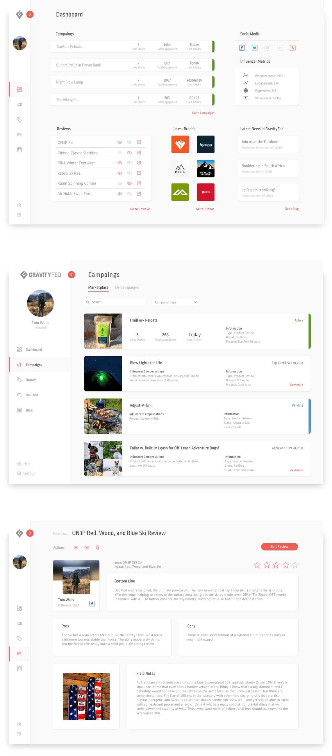
[ new features ]
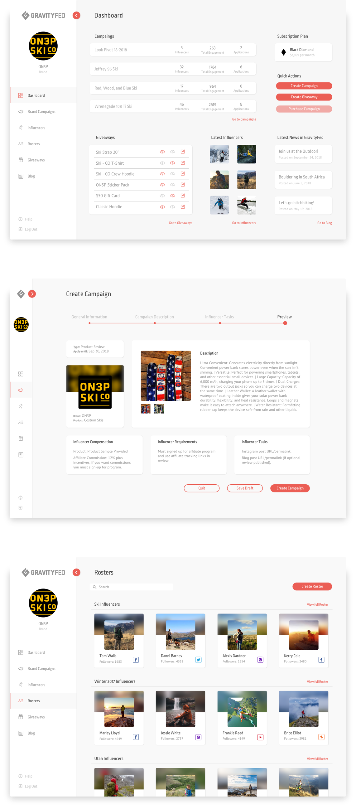
Dashboard where users can have an overview of their activity is one of the new features added to the platform.
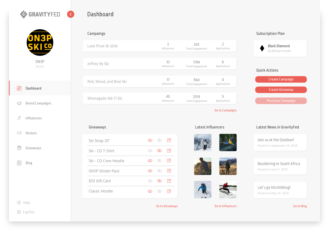
[ responsive design ]
Desktop and mobile screens were designed in parallel to create useful features in the mobile version.
[ project goal ]
This is a freelance project. Based on the client’s demands, the main tasks were to redesign the interface of the existing platform, improve the navigation, and curate the content in order to create a new experience for the user.
design process —
[ context ]
GRAVITYFED™ is the only influencer marketing platform specifically focused on outdoor and adventure. The client wanted to improve the overall interface and navigation to engage content with the client’s targeted audience and be able to boost awareness and drive sales.
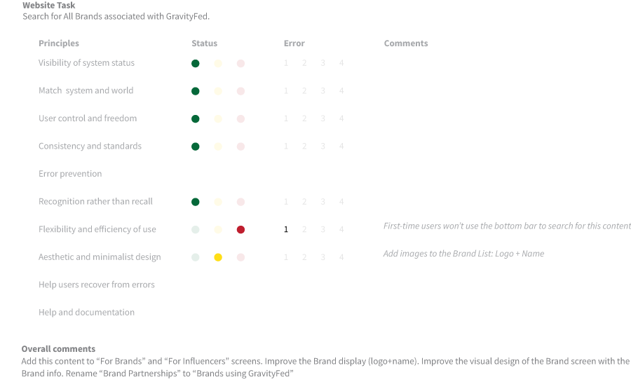
[ heuristic evaluations ]
As a visual interface analysis, I evaluated how the user could react, what could simplify their navigation and enhance the overall experience. Based on this evaluation, a lot of new features and changes were added to the client’s original demands.
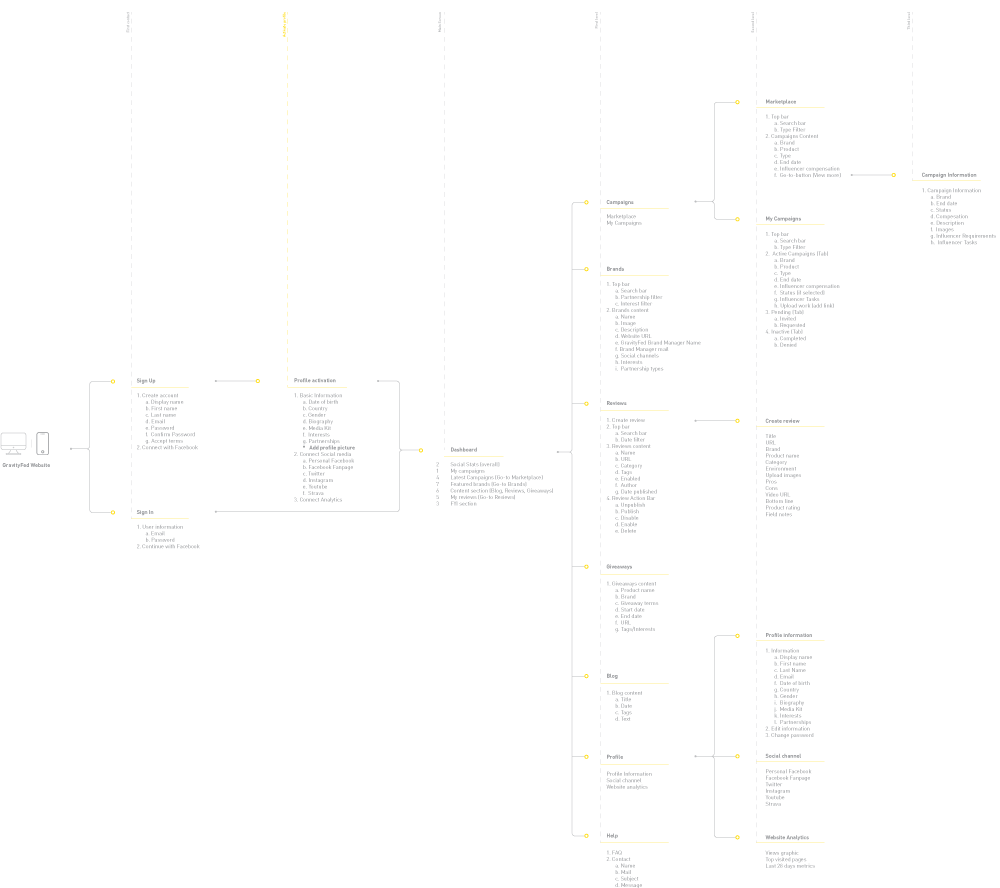
[ new information architecture ]
The new information architecture was based on the new elements the client wanted for the platform, along with the features I gathered from the heuristic evaluations. This analysis simplified the navigation path and the number of screens needed.
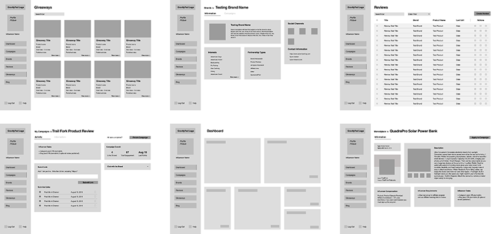
[ wireframes ]
Once the navigation and the screens were defined, I started the design iterations to create a screenflow that could work as an MVP (Minimum Viable Product). Based on this MVP, the client started to give feedback until they were satisfied with the outcome.
[ design validation ]
It is important to highlight that throughout the design iteration process I worked along with the development team. This collaboration aimed to conceive a final product that could be designed and implemented in a time range previously defined by the client.
final result —
[ final design ]
The GravityFed platform was redesigned and improved with new features and new screens intended to simplify the usability for influencers and brands.
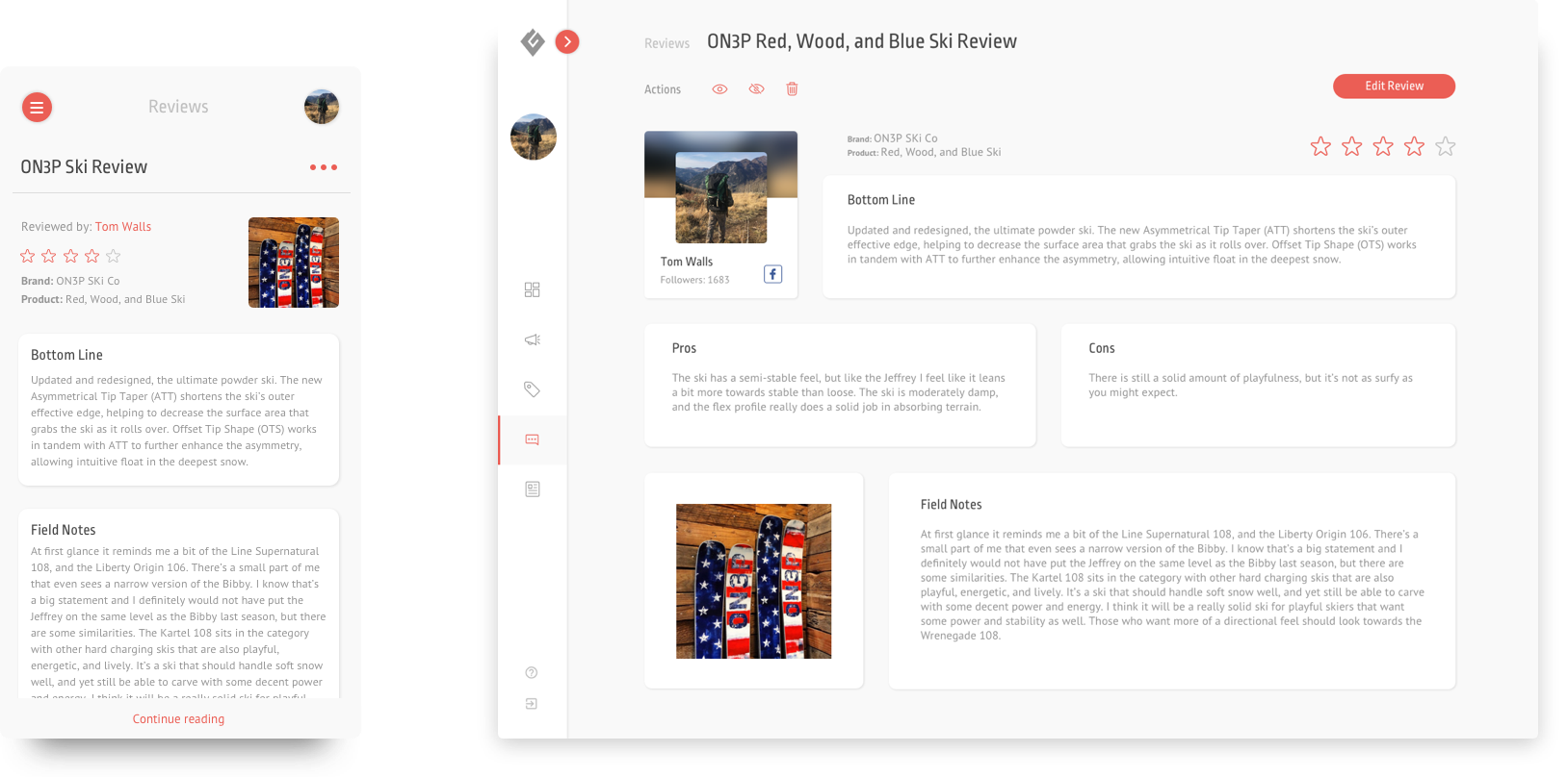
[ brand section ]
[ influencer section ]
[ final thoughts ]
This project had specific deadlines and was done in collaboration with a developer team. Having a short time to develop the project allowed me to understand which were the key steps for a usability analysis to create a meaningful outcome. Working along with the developers also allowed me to learn how to create a design solution that simplifies their workflow to create a functional, good-looking product.
Sole UX/UI Designer