DokArt
— film festival
[ summary ]
DokArt is a conceptual project inspired in dokumentART, an alternative film festival that features documentaries, short films, and animations. This project is focused on creating a transmedia experience for the festival enthusiasts in Neubrandenburg, Germany.
overview —
[ brand identity ]
A new visual language for the festival, aiming to create a new identity focused on modern media.
[ analog information ]
Printed information systems to create a bridge between the analog and the digital media.
[ digital applications ]
Modern times require modern media. Digital applications to improve the festival's overall experience.
[ project goal ]
Redesign the festival’s visual design focusing on the experience across multiple platforms and media, by creating a link between analog information systems and digital technologies.
design process —
[ process & context ]
Transmedia design aims to combine multiple media forms. A transmedia project may combine prints, graphics and animation, digital platforms, and interactive websites or advertising outlets.
Inside the cinema, the analog and the digital coexist to create an experience for the user, which is basically what transmedia design focuses on.
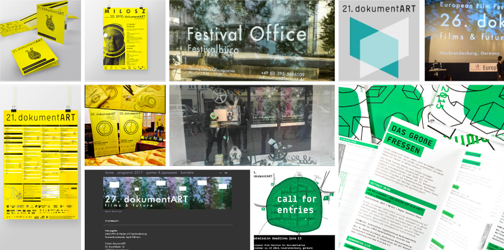
[ event analysis ]
As a first step, analyze all possible elements regarding the event environment. A mood board was necessary to understand how the festival works and also to identify attendees in the event photos to try to understand their target group.
[ visual analysis ]
The visual language changes every year according to the main topic selected for the festival. The lack of a specific graphic line and key elements in DokumentART allowed the project to grow in any direction.
[ market analysis & personas ]
Market research was done to understand the optimal features and direction of a festival with such a varied audience. Once the market was analyzed, the personas allowed the project to focus on three main users: an experienced filmmaker, a film enthusiast, and a young interested rookie.

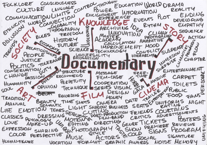
[ brainstorm ]
A study of terms and related words was undertaken to understand the concept of “Documentary” on a more linguistic level and therefore explore the possible metaphorical of the branding to be developed.
[ moodboard ]
A quick mood board with references helped us to materialize on a small scale the expectations of the final result in terms of image and graphic elements.

[ paper first ]
Based on the brainstorming from the conceptualization, sketches were generated with ideas for the logo, based on the idea of creating a graphic element that accompanied the typography or simply playing with typography to behave in different ways representing a certain concept.
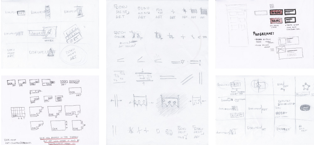
[ digital approach ]
After sketching and analyzing the results, we realized the square was a big graphic element to exploit. The digitalization was filtered by those ones that had a rectangle.
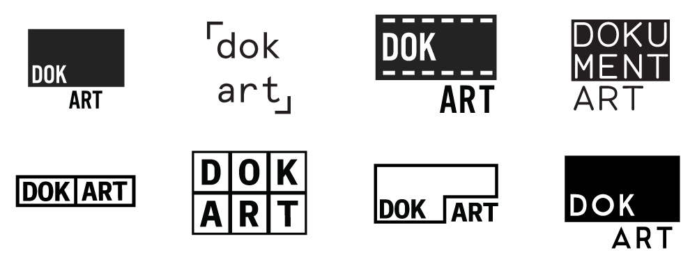
[ design analysis ]
At the end of the iteration process, we ended up with three main concepts. We analyzed these concepts based on our previous analysis for the event and its visual language to finally decide for an outcome that could represent the festival's identity.
final result —
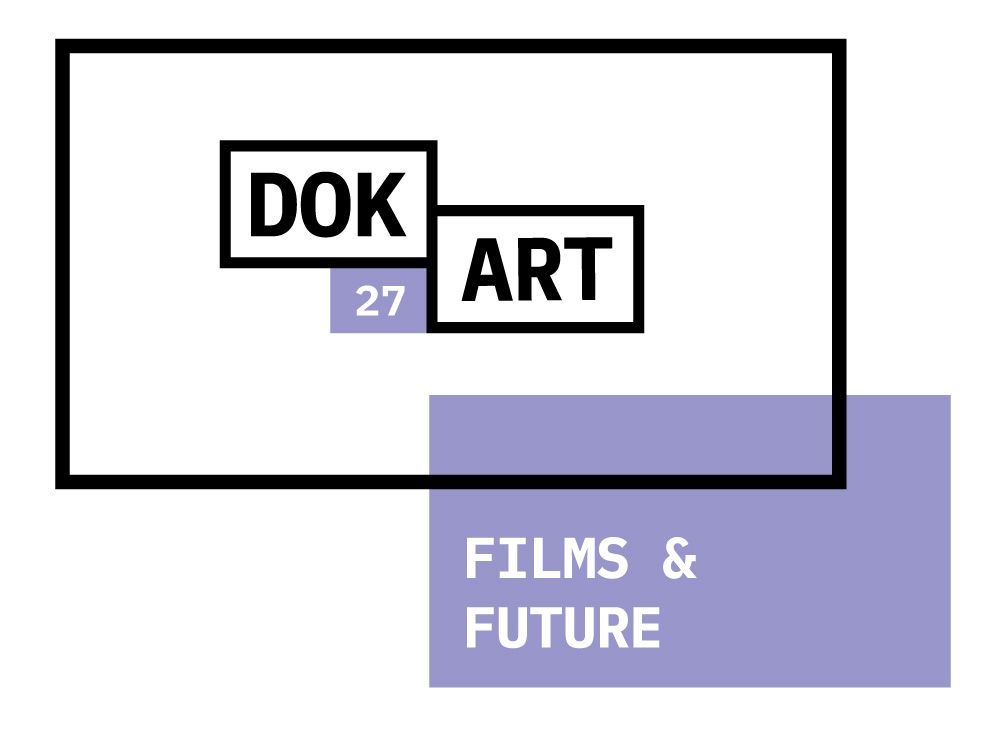
[ final design ]
One of the most important changes in the design concept was the simplification of the festival name. As a result of research into existing documentary events, we discovered that the word “Doc” refers directly to Documentaries and there are even lots of events with this diminutive.
[ final concept ]
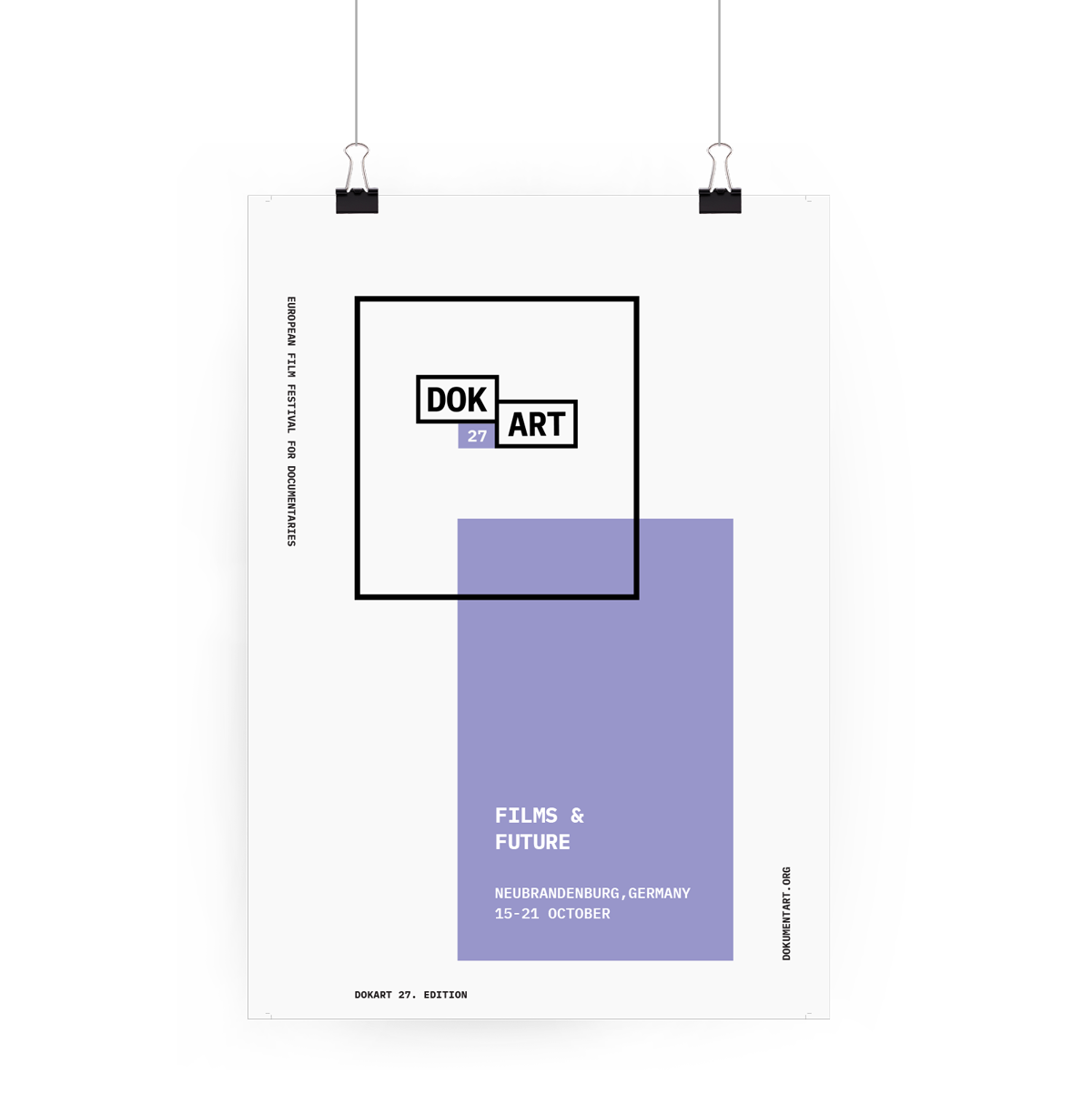
The rectangles have a similar aspect ratio to low-budget film projections (1.66:1) which evokes the part of the film within the design.
The separation of the words “Dok” and “Art” gives the flexibility to explore both sides of the festival.
Finally, the gap between the two rectangles represents the duality between the technical and the artistic part, but at the same time represents that they coexist to create an experience.
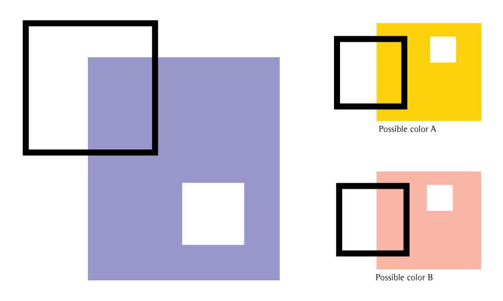
[ color concept ]
The concept is based on the idea of using black, white and a highlight color, to use it as a differentiator element every year, representing the event’s topic for the festival.
For this current version, the highlight color is based on the existing color palette used for the 2017 edition about the topic “future”.
Keeping the color is a way to show the evolution from DokumentART to DokArt.
[ a new identity, a new media ]
Animation to introduce the new logo and to communicate this new transmedia design approach for the festival's brand identity.
analog applications —
[ poster ]
Used as a motivational source to invite people to the festival and give an overall feel of the new minimal image that will be used all across the applications. The information was brought to a simple form and refers only to the topic of the year with the website link for further info.
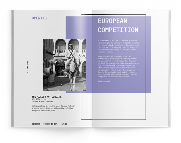
[ booklet ]
This printed application is an overview of the films (director, duration, country, and synopsis) and each competition taking place at the festival. The idea is to allow the users to decide which specific film or competition fulfills his or her interest.
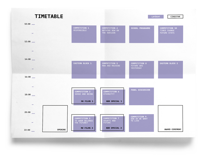
[ foldable timetable ]
Gives the users a quick graphic view of the screening agenda, the year’s main topic, and the sponsors from the event. When handed with the booklet it creates a complete guide to the festival, keeping the visitors informed about the different events.
digital applications —
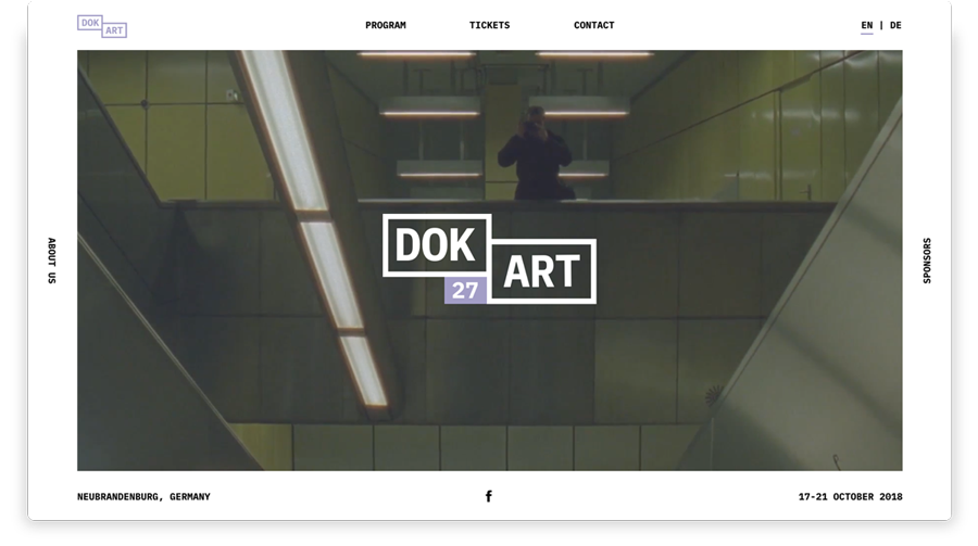
[ website ]
The website has all the information the user needs to find the films, competitions and other events from the festival. The concept of the site is to recreate a camera frame that works as a static menu for navigation.
[ festival animations ]
Animations used to introduce the films during the festival. It creates a dynamic composition of the graphics used in all applications and keeps the concept of film formats across the different elements of the animation.
[ final thoughts ]
Even though this project was focused on communication design, as an interaction designer it’s important to have general knowledge about transmedia design and how it merges the analog and digital. Analog systems are always a nice solution for tangible applications and as designer, my goal is to make them coexist with the upcoming technologies and media.
HfG Schwäbisch Gmünd, Transmedia Design — 2018